Enhancing Space for Grief's digital presence

As a Creative/Design Intern, I led the end-to-end website redesign for Method Collective's flagship installation and broader public movement, improving content clarity and navigation to help 9000+ visitors confidently make informed decisions.

Domains

Web Design

Visual Design

Content Strategy

Team

Denise Amelia (Me)

Fran Rawlings (Co-Founder)

Calla Lee (Co-Founder)

Ziyan Hossain (Co-Founder)

Toolkit

Squarespace

Miro

Figma

Duration

4 months

Space for Grief is a growing public art installation and broader movement

Created by Method Collective founders Fran Quintero Rawlings, Ziyan Hossain, and Calla Lee, Space for Grief seeks to create conversations around and destigmatize grief. By bringing awareness to how grief permeates every part of society, they hope to inspire lasting community wellbeing.

Website visitors aren't getting the information they need to confidently act on their goals, stunting plans for growth

Confusing information hierarchy, a lack of content strategy, and poor visual design made it difficult to find and comprehend information relevant to their goals (ex: going to the installation, donating, etc.). This in turn prevents Space for Grief from achieving their broader goals of scaling the initiative.

How might we support site visitors in making informed decisions that support Space for Grief's growth?

Introducing ...

Before

After

↓ Keep scrolling to see the process + full solution!

Space for Grief wants to scale their impact with visitor autonomy in mind

In our initial discovery call, the founders emphasized the importance of empowering visitors with informed choice rather than forcing them to a certain action. As a result, we deemed that making information digestible and intuitive on the website was our top priority to reach the following objectives.

Reach more audiences

Increase donations and funding

Get more collaborations for art and music

Get more opportunities for exhibition

The current website experience makes it difficult to find and process information

To investigate how the website performs in delivering information, I interviewed 5 site visitors about their experiences and conducted a site audit. Sorting the findings revealed prominent issues in 3 key areas:

Confusing Information Hierarchy

A large amount of navigation items created decision paralysis while lengthy paragraphs, lack of imagery, and poor typography diluted focus.

Lack of Content Strategy

Information gaps were created as a result of outdated/missing content around donations, collaborations, and the installation experience.

Poor Visual Design

The website felt disconnected and less credible due to inconsistent margins, layouts, image sizing, and poor contrast.

Site visitors need information around the event, credibility, and value alignment to make important decisions

Talking to the founders and visitors, I discovered 2 main demographics of site visitors with similar needs for information, but different priorities depending on their goals. Both of them however, expressed the need to feel aligned with the organization's values to offer their support.

Guests

Goal

Look for event information to decide if they should make the trip and experience the installation.

Pain Points

"I'm not sure I get what Space for Grief is, there's so much to read through"

Info Hierarchy

"What can I expect to see or do there? There's no photos of people interacting with the space."

CONTENT

Visuals

"How is this going to help me process my emotions?"

CONTENT

"It's hard to read information about the event dates."

Info Hierarchy

Donors/Partners

Goal

Assess credibility to decide if they want to fund or collaborate with the initiative.

Pain Points

"How can I support the initiative if not through sponsorship, what if I want to partner for research?"

CONTENT

"What are my donations being used for? I'm not sure where my funds are going."

CONTENT

"The website doesn't seem maintained, can I trust it?"

Visuals

This persona is currently informed by secondary accounts. Consultations with this demographic are in order!

I defined four action items addressing these considerations

These design decisions guide visitors to relevant information for decision-making and compel them to act upon their goals, which will allow the initiative to continue expanding and delivering value.

01

Improve Site Navigation

Empowers visitors to quickly locate relevant information.

Info Hierarchy

02

Standardize Visual Elements

Establishes credibility and strong brand presence, promoting receptiveness to information.

Visuals

03

Update or Introduce New Pages

Addresses information gaps and creates opportunities to communicate shared values and event information.

Content

04

Combine Text and Image Effectively

Creates a more engaging learning experience through visual reinforcement, promoting information retention.

Info Hierarchy

Content

Visuals

Similar websites informed established conventions to improve visitor learnability

Websites in the nonprofit and art spaces with similar visitors (ex: David Suzuki Foundation, AGO, WWF, etc.) were helpful references for topics to include and how they are typically presented. Carrying these over to our site will ensure quicker access to the expected information for visitor goals.

A content strategy helps tie content back to the needs of both visitor demographics

Based on the information gaps we uncovered in interviews and reference sites, the founders and I revised existing content and created pages to house new content. With our copy, we made sure to write with a respectful and gentle tone considering visitor autonomy and grief as a sensitive subject.

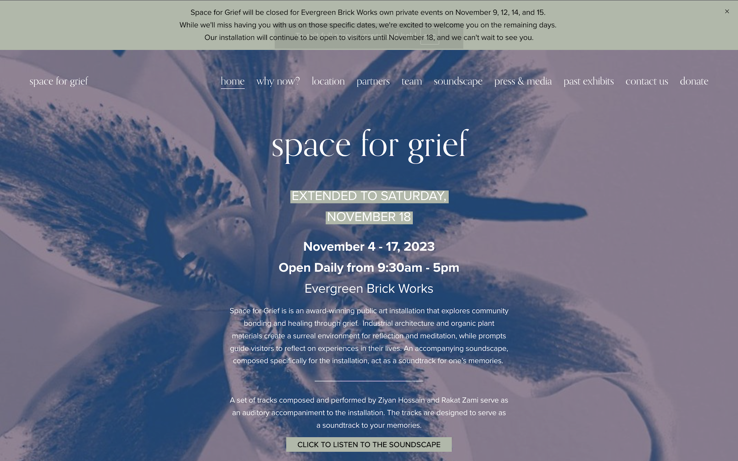
Introducing dropdowns reduces information overload while keeping pages easy to find.

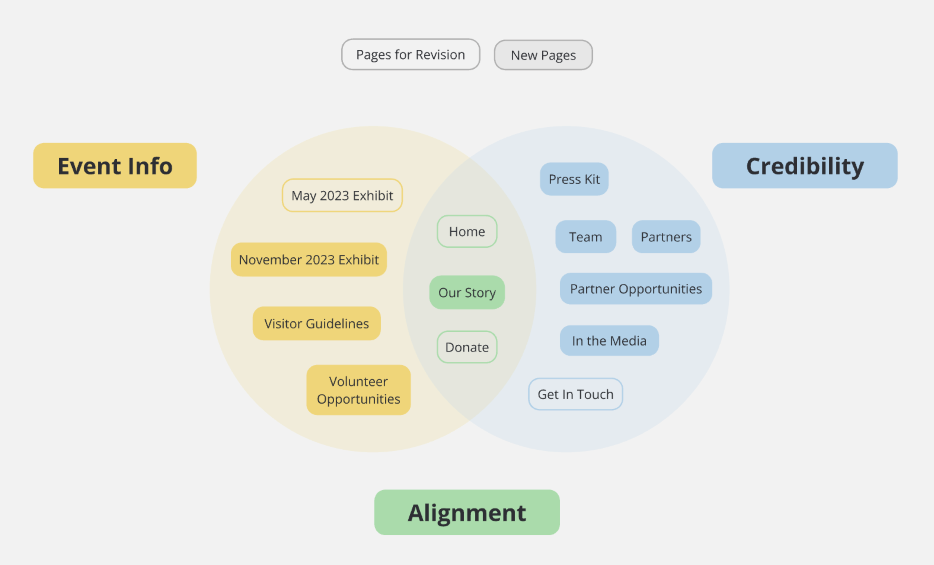
The introduction of new pages and existing issue around a crowded navigation prompted a restructuring of the site map. Changes were informed by five card sorting exercises with visitors to ensure it aligns with their mental models.

Original Site Map + Navigation

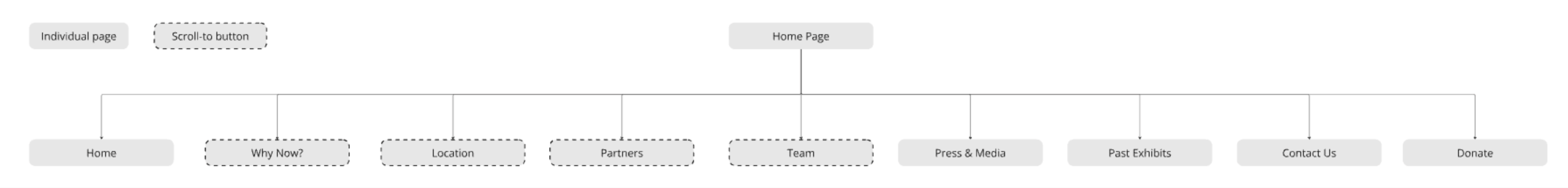
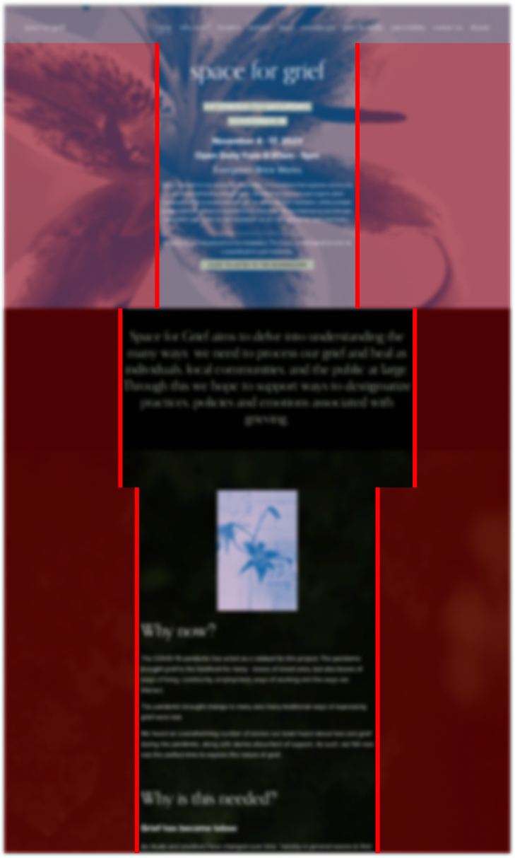
Originally, some items on the navigation launched a scroll to corresponding sections within the home page, confusing site visitors.

Revised Site Map w/Dropdowns

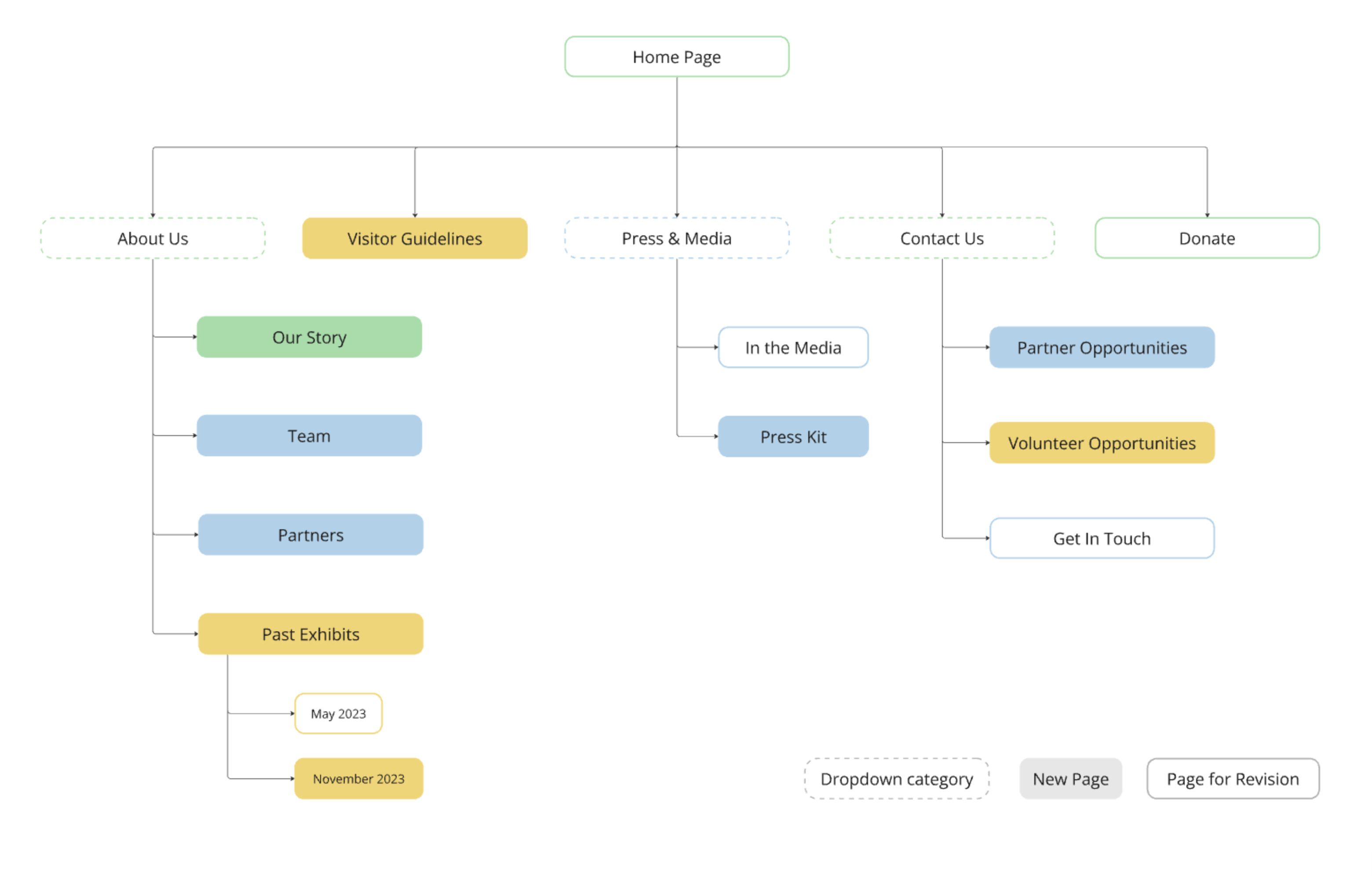
With a modest amount of pages, a one-level dropdown manages to keep all available pages within quick reach!

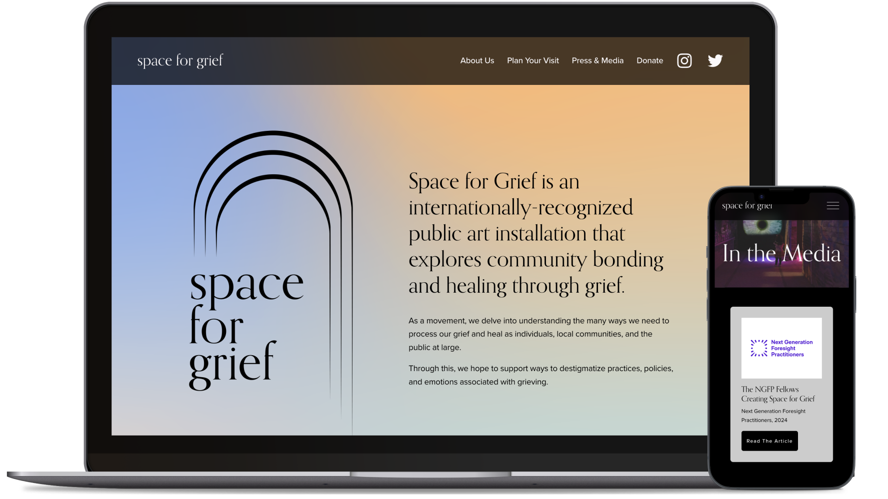
Improving readability and brand presence using existing visual systems

Working within Squarespace's Fluid Engine system, I tweaked several visual elements (typography, colours, etc.) to create more hierarchy and legibility. Additionally, I found several opportunities to incorporate Space for Grief's existing branding into recurring elements, creating consistency across the different pages.

Margins

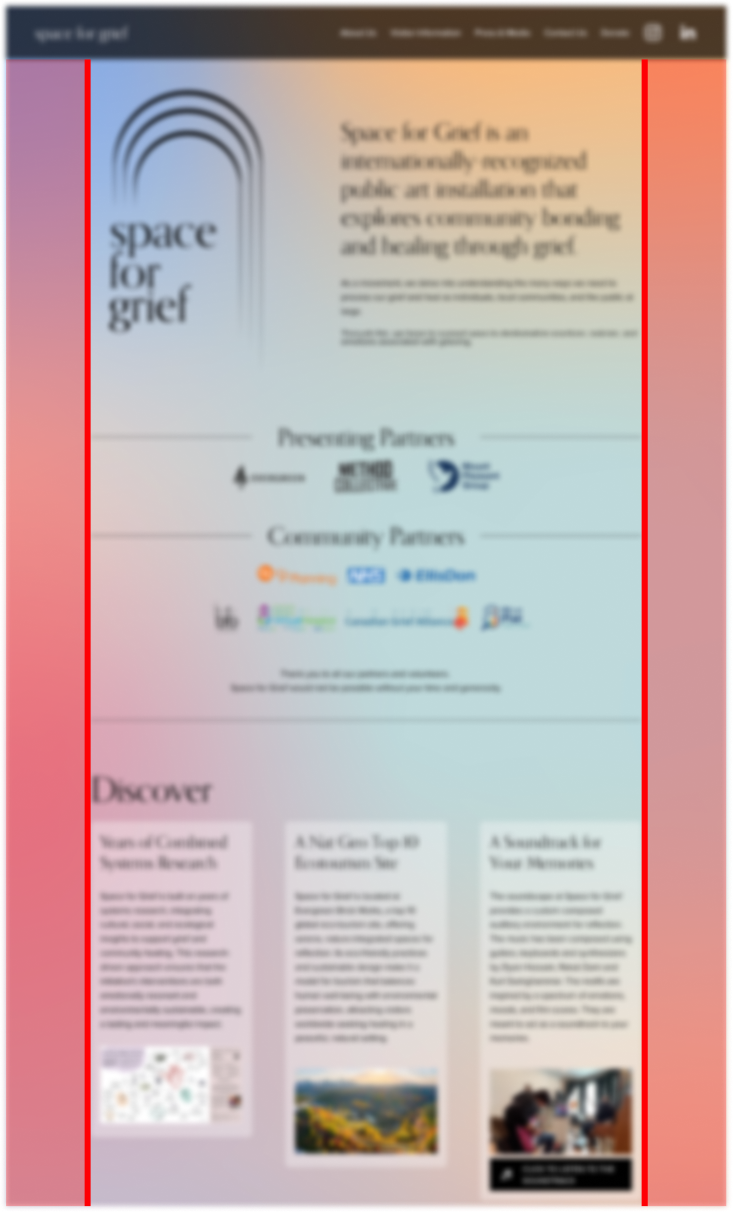
I aligned content and tightened the margins to make use of the space, creating a comfortable reading experience.

Previously, content blocks in each page adhered to different margins.
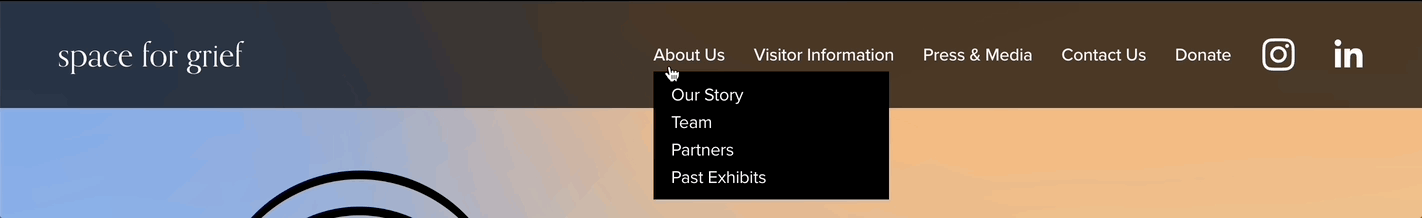
Page Headings

Each page has a visible title heading with a matching image or GIF to anchor visitors and add storytelling.

Previously, page titles were only visible in the browser tab.
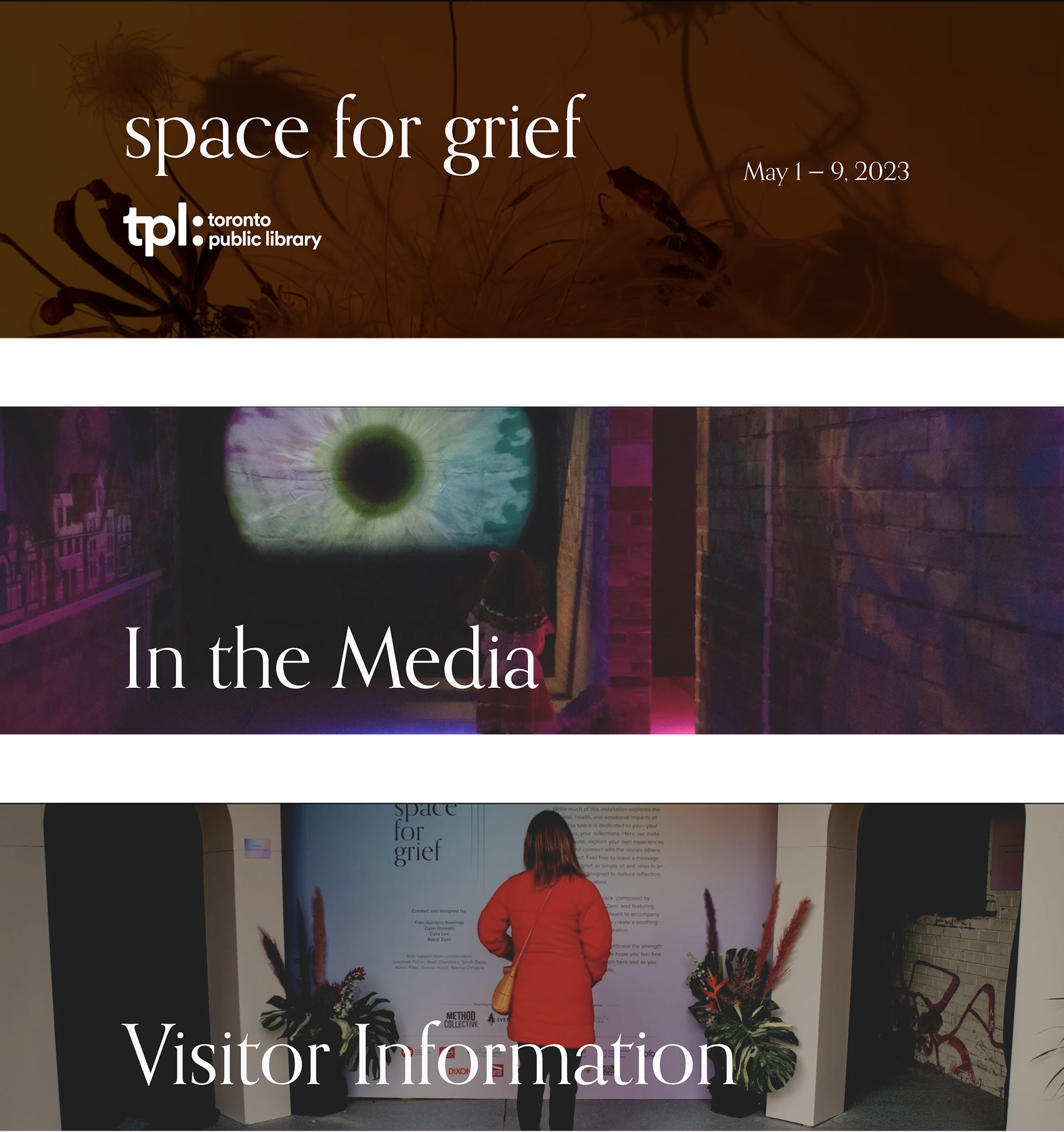
Image Frames

I mainly used the "arc" shape to call back the logo, and applied a border radius to landscape-oriented images.

Previously, vastly different shapes were used to frame images.

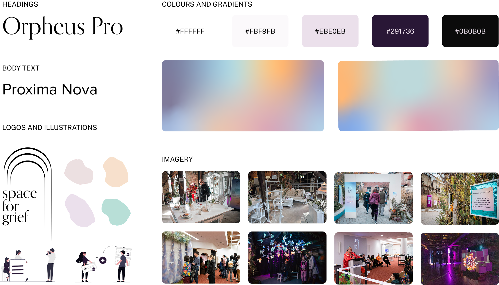
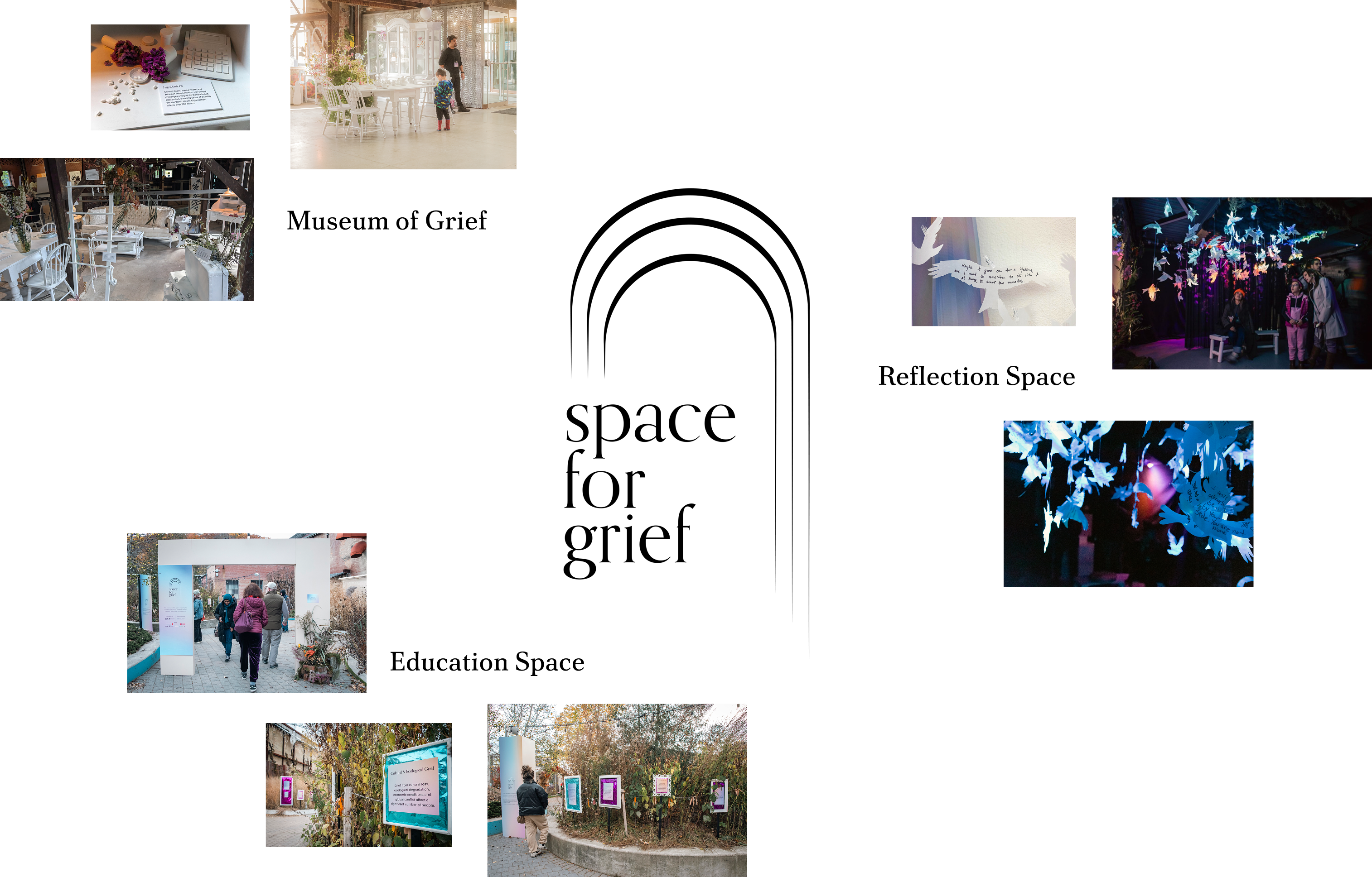
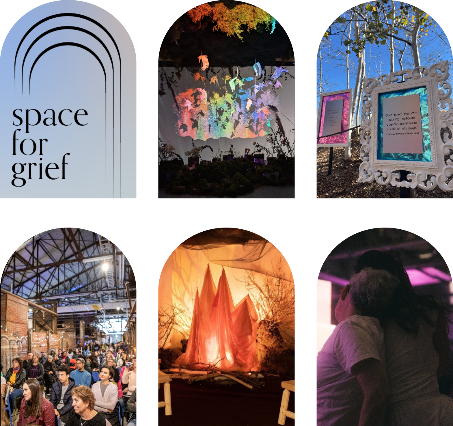
The existing brand style, which I expanded on and applied more consistently throughout.

One limitation the previous website faced was a lack of pictures, but now that more installations have happened, there is an abundance to use as content or to reinforce the written content. Images were selected based on their relevance to the topic, quality, and narrative strength.

Custom code helped refine visual elements a step further

As a drag-and-drop website builder, Squarespace can be limited in terms of styling and granular control. Custom code referenced from the Squarespace forums allowed me to introduce micro-interactions that boost engagement as well as brand-aligned styling to enhance visual cohesion.

Adding a hover state to imply it is a clickable link.

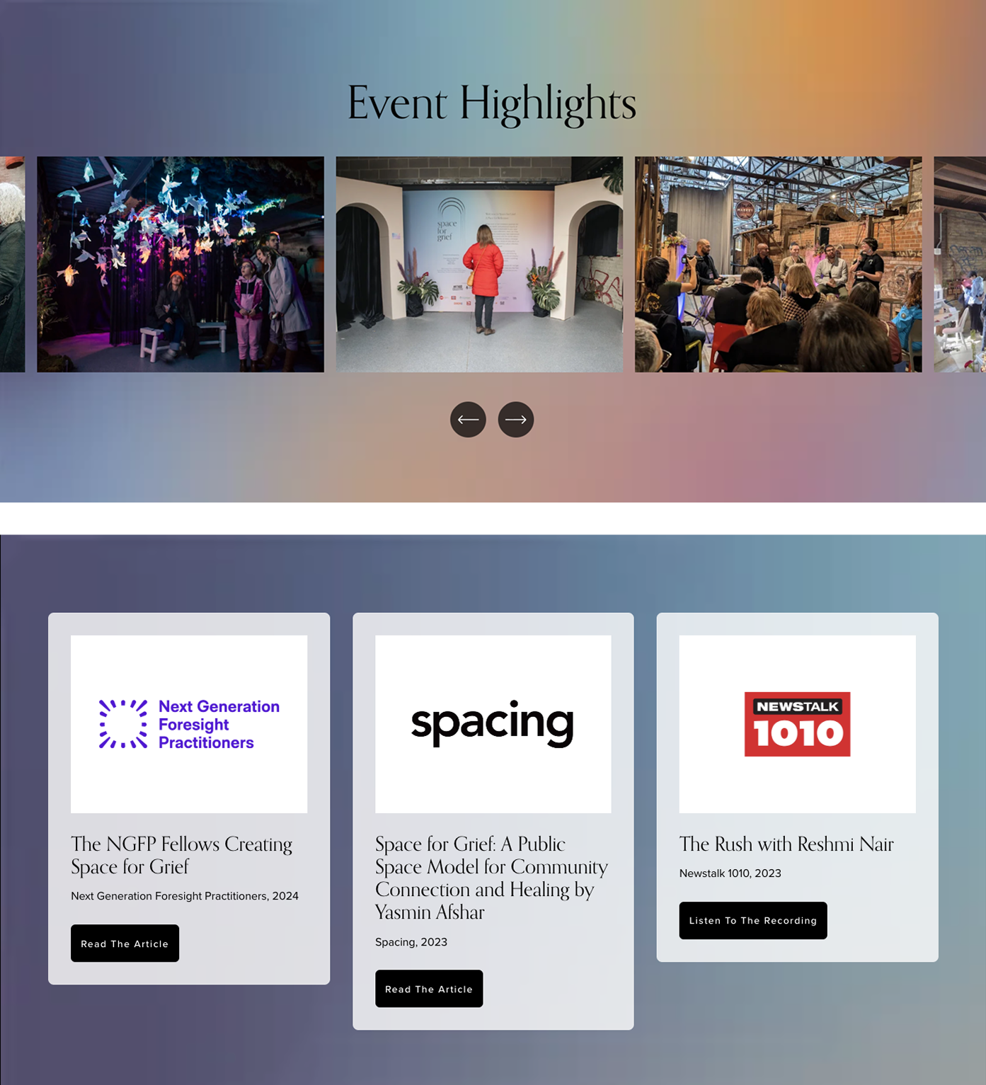
Using Space for Grief gradients as a background image.

The website, among many other things, is a team effort

All of the designs went through multiple iterations and reviews with the founders to ensure the shipped designs met the standards for content, visual design, and readability.

When I wasn't working on the website, I was collaborating with other teams, chipping in on creative direction, and building the installation on-site with volunteers to bring the 2024 installation to life! Thanks to these people, I was given the space to grow and be part of something bigger than myself.

A cohesive website guiding visitors to the information they need to act on their goals

*Insert images of the different pages here, maybe 3-5, with features that link back to the action items.
*Insert link to the actual website

Testimonials

Fran Rawlings

"Lorem ipsum dolor sit amet, consectetur adipiscing elit, sed do eiusmod tempor incididunt ut labore et dolore magna aliqua. Ut enim ad minim veniam, quis nostrud exercitation ullamco laboris nisi ut aliquip ex ea commodo consequat."

Ziyan Hossain

"Denise is proactive in learning about new industries, web design paradigms, and user behaviors to create pragmatic and useful designs. She demonstrates flexibility when dealing with dynamic work environments and experimenting with multiple approaches. A pleasure to work with!"

Calla Lee

"Lorem ipsum dolor sit amet, consectetur adipiscing elit, sed do eiusmod tempor incididunt ut labore et dolore magna aliqua. Ut enim ad minim veniam, quis nostrud exercitation ullamco laboris nisi ut aliquip ex ea commodo consequat."

Next Steps

Auditing content strategy and design to understand impact

Due to some constraints, I wasn't able to consult site visitors about the design decisions we made. Moving forward, ensuring it actually reflects their needs will help us strengthen our design and content strategy before we continue to expand our site offerings.

Takeaways

Designing for art, business, code, humans, and everything in-between

As the sole web designer faced with constraits around time and capacity, I had to be resourceful to deliver an effective website experience. This taught me to be proactive and pick up new skills and knowledge quickly to make optimal design decisions.

The importance of a good content strategy

Coming into this, I was eager to apply visual design and information hierarchy to improve the experience, but soon realized they were meaningless without good content. By being intentional with our content from the very start, we ensure our audiences get the value they are looking for.

Getting it out beats getting it perfect

This was my first time shipping a design with real world implications, and this experience hammered the importance of getting core messages/functions out first and refining them later.